Capabilities
- Brand Identity
- Copywriting
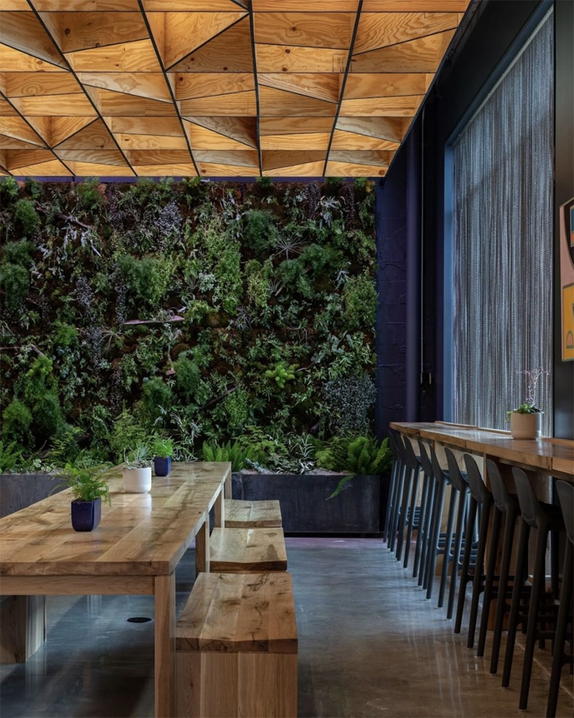
- Environments
- Illustration
- Naming
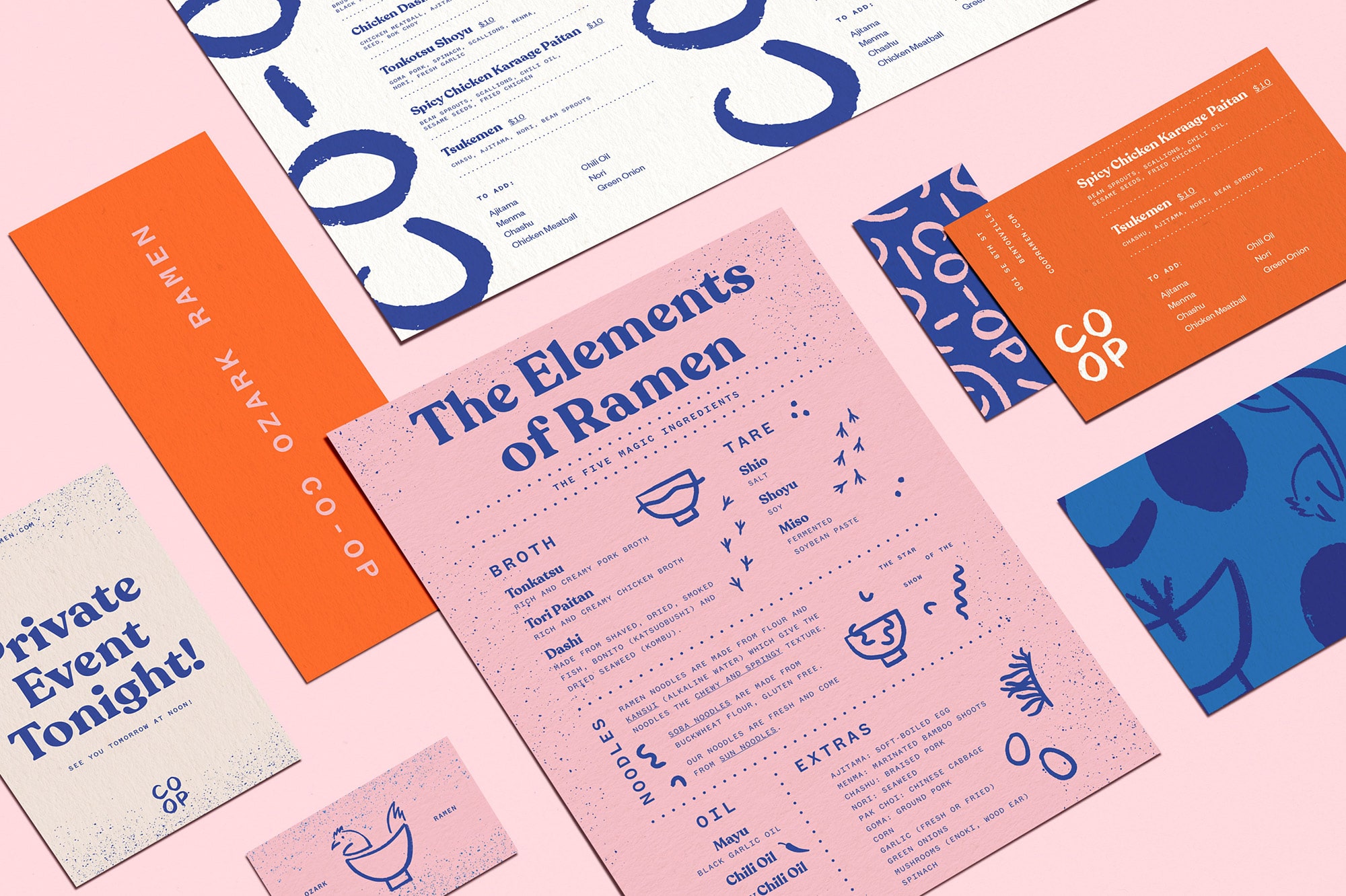
- Packaging
- Signage
Objective / Solution
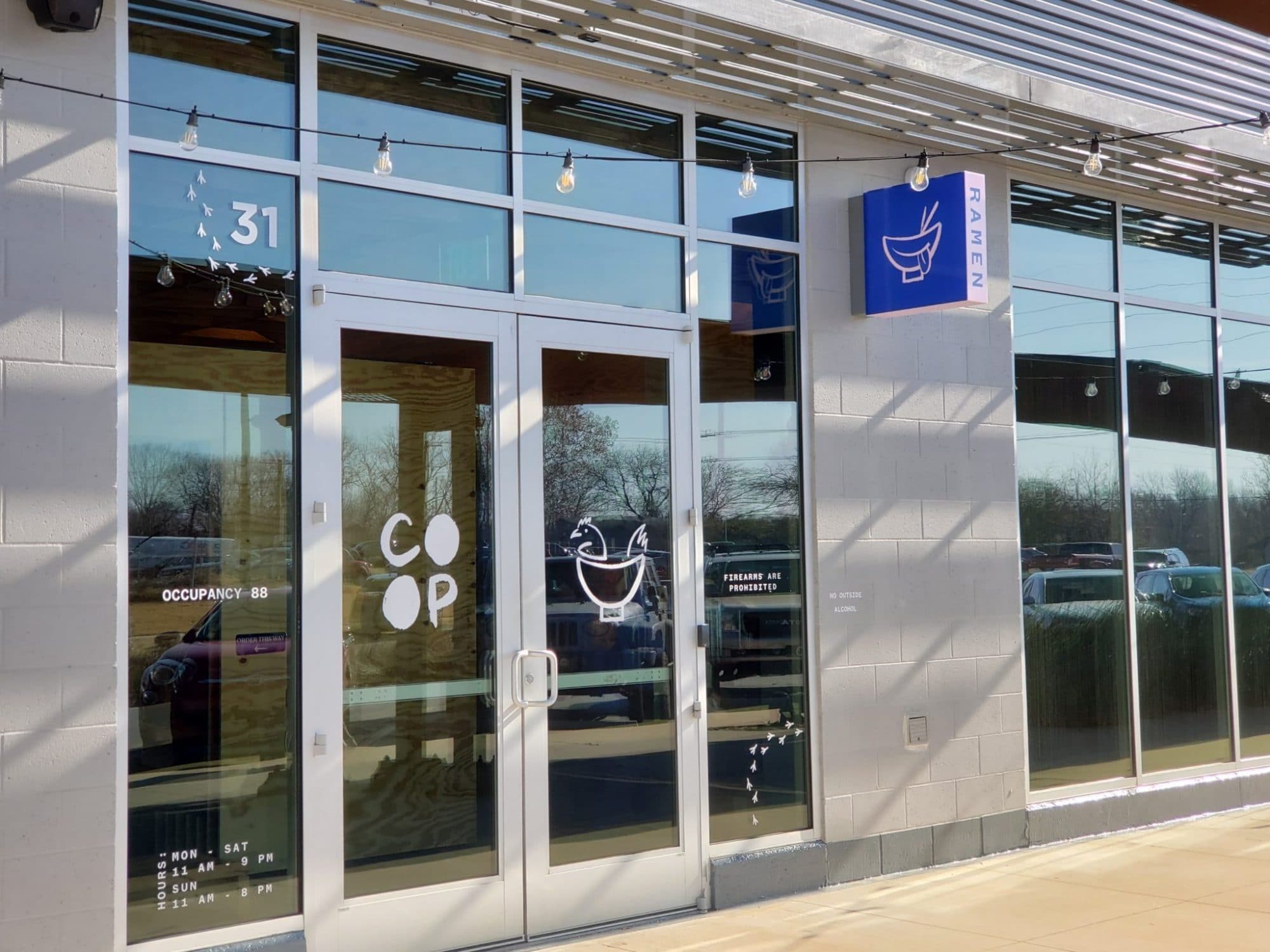
Help a hometown hospitality company bring neighbors, community, and noodles together in an Ozark ramen house in Bentonville, Arkansas.


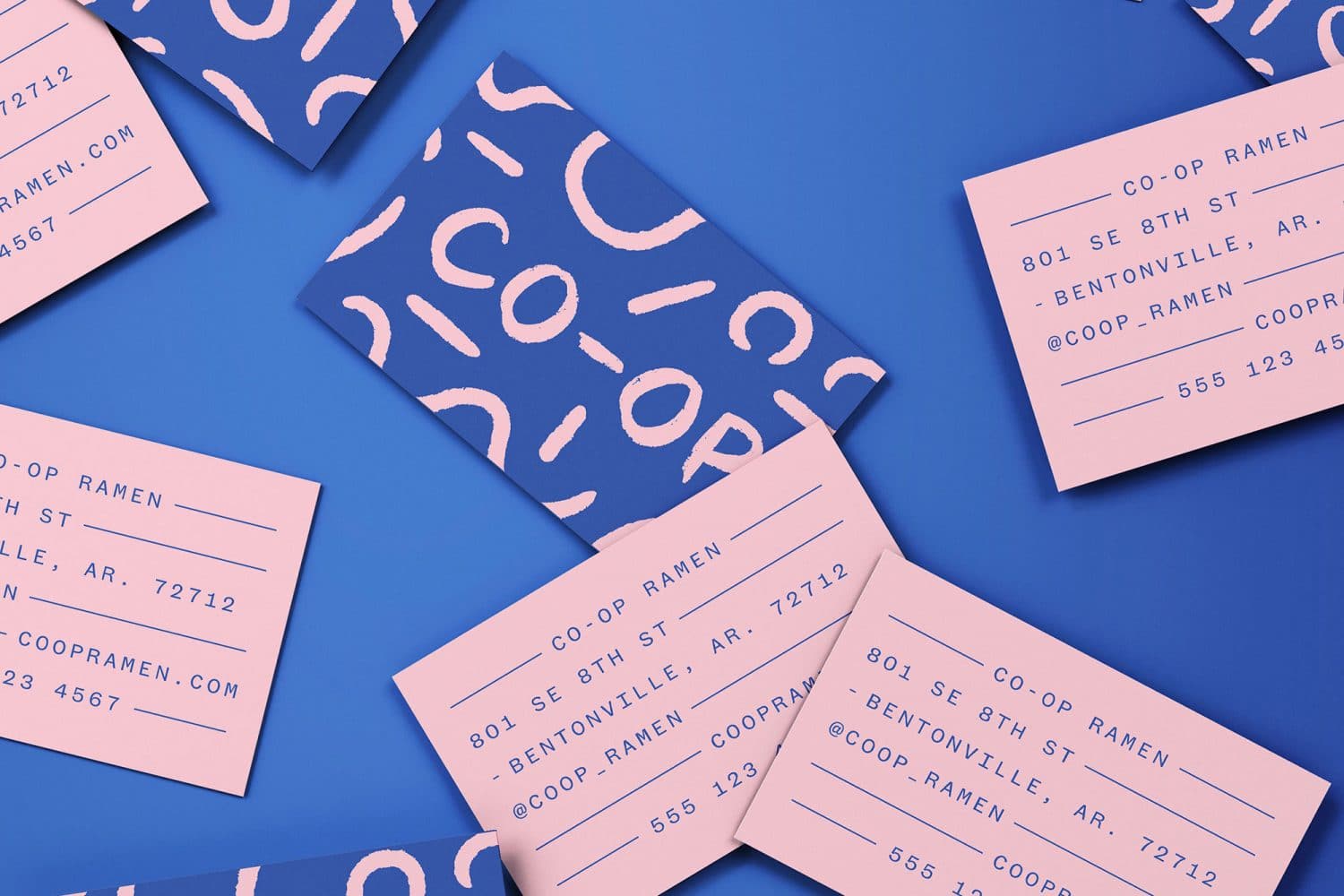
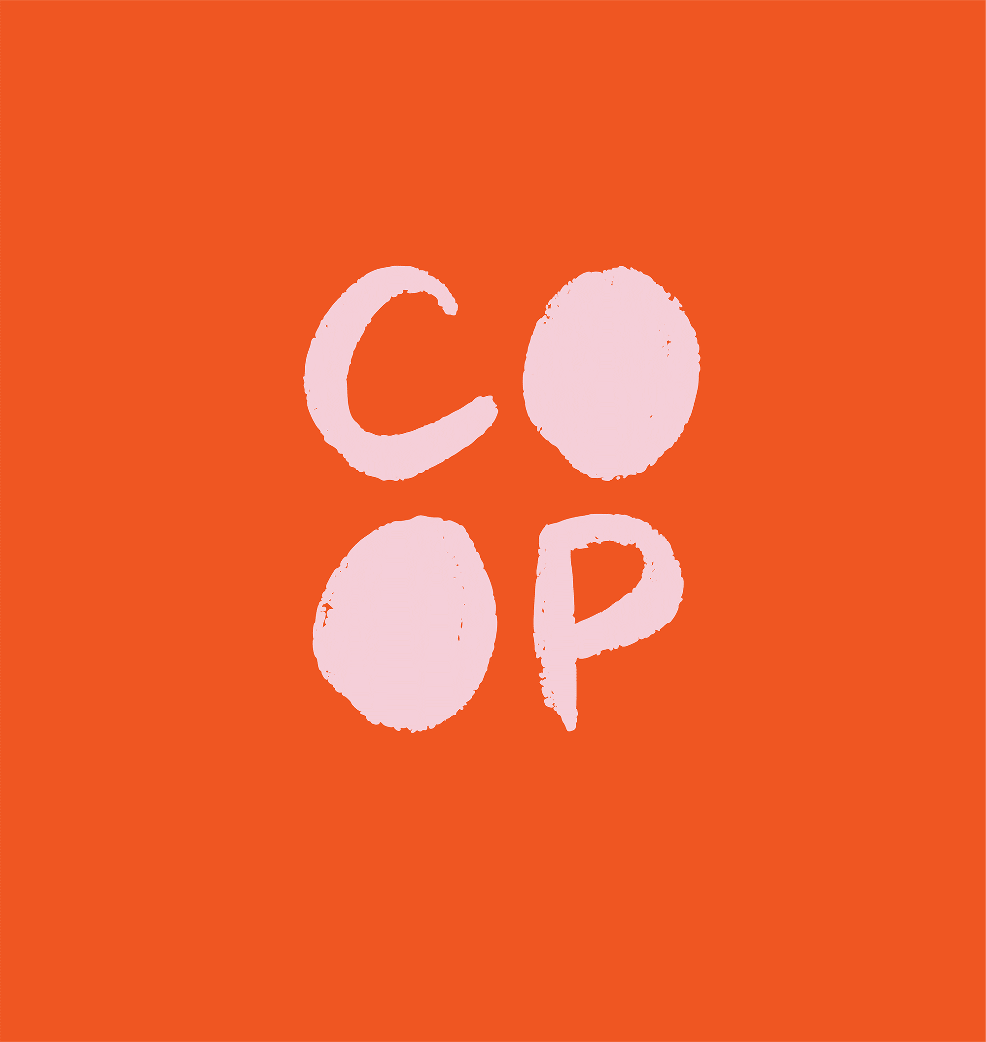
The name, CO-OP, is short for cooperative — an autonomous association of people united to meet common needs and aspirations. It can also be read as “coop,” as in chicken coop, a nod to Bentonville’s love of chicken.
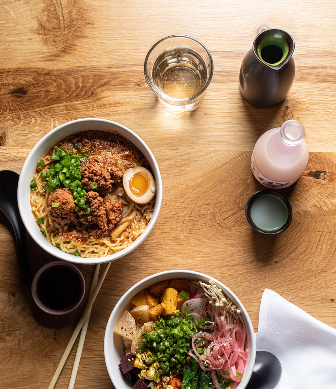
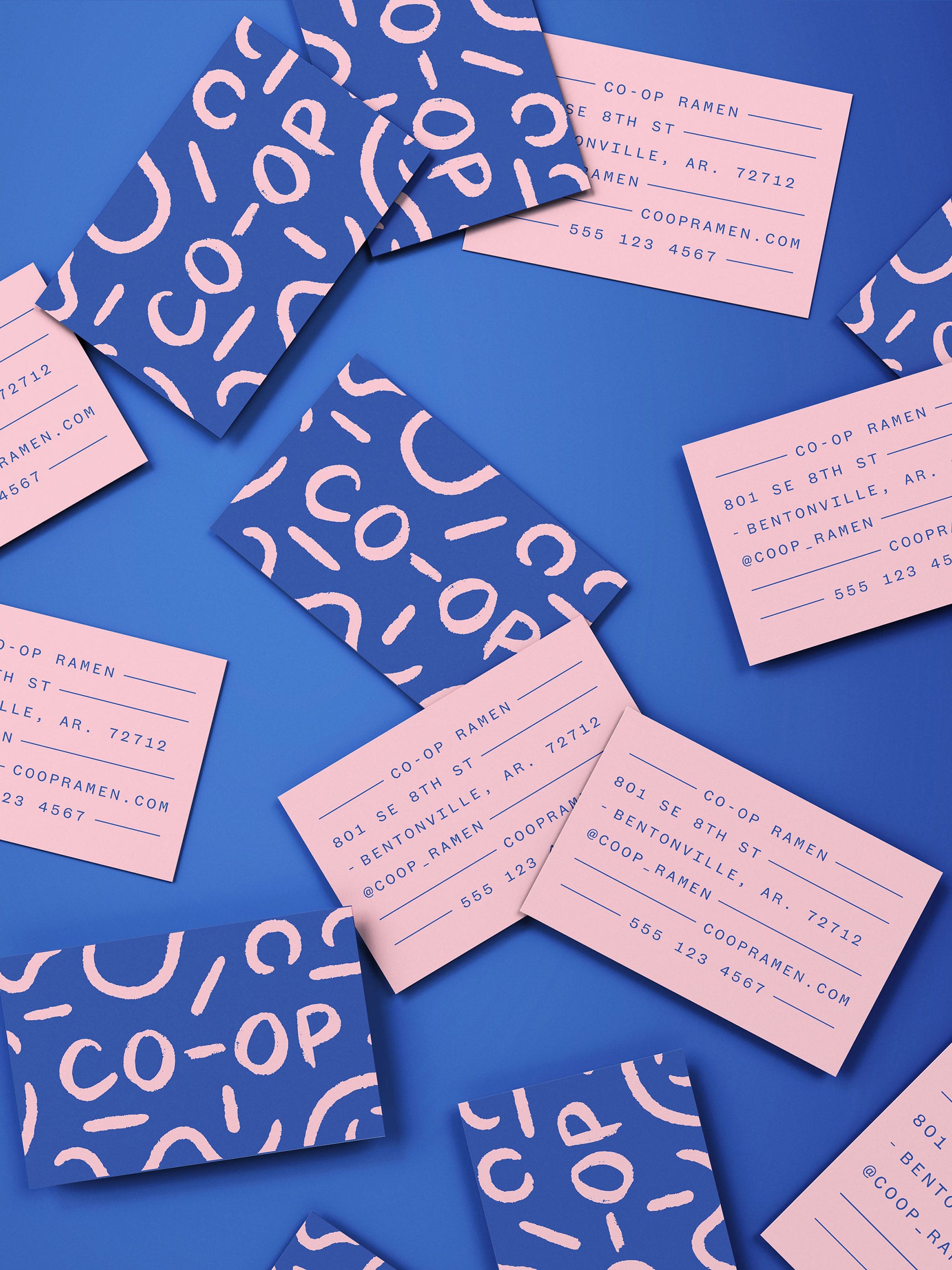
The identity honors the bold and curious personality of the CO-OP brand. Distinct, imperfect letterforms create a simple, iconic mark that easily translates across mediums and platforms. A hand drawn primary mark depicts a traditional ramen bowl and chicken, nodding to ramen’s delicious, comforting simplicity and CO-OP’s Ozark roots.

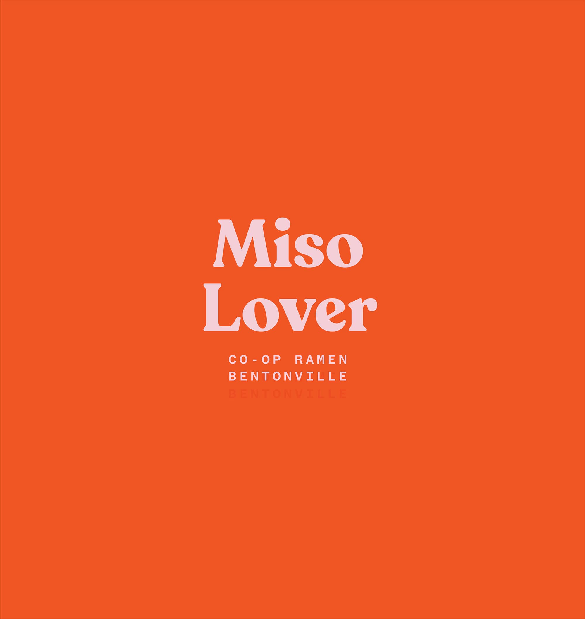
The color palette’s vivid hues pair beautifully with the more muted, natural tones of the restaurant’s interiors. Vibrantly colored menus guide guests through shareable plates and ramen options while outlining the elements of ramen for all those new to the Japanese comfort food.
Hand drawn graphic elements creatively expand the brand’s visual language, adding playful, personal touches to this authentic neighborhood brand.