Capabilities
- Brand Identity
- Brand Positioning
- Copywriting
- Illustration
- Packaging
Objective / Solution
Craft an identity and packaging for an Asian female-owned beauty company taking a modern approach to ancient rituals for radiant skin.
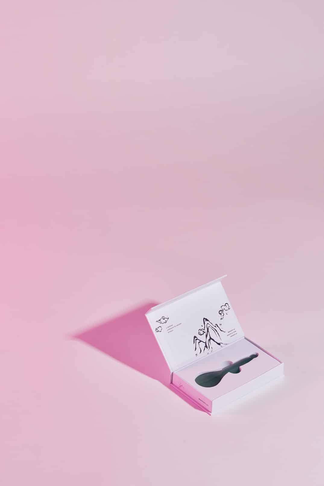
Mount Lai is a beauty brand rooted in traditional Chinese medicine. Inspired by her grandmother who believed that skincare, jade rolling, and gua sha are self-care rituals, esthetician and founder Stephanie Zheng set out to create skincare tools and products made with natural ingredients used in traditional Chinese medicine and backed by science.
The identity reflects the brand’s sophisticated aesthetic and cultural roots, balancing tradition and modernity.
The primary logo employs slightly rounded sans serif letterforms that feel inviting, timeless, and elevated.

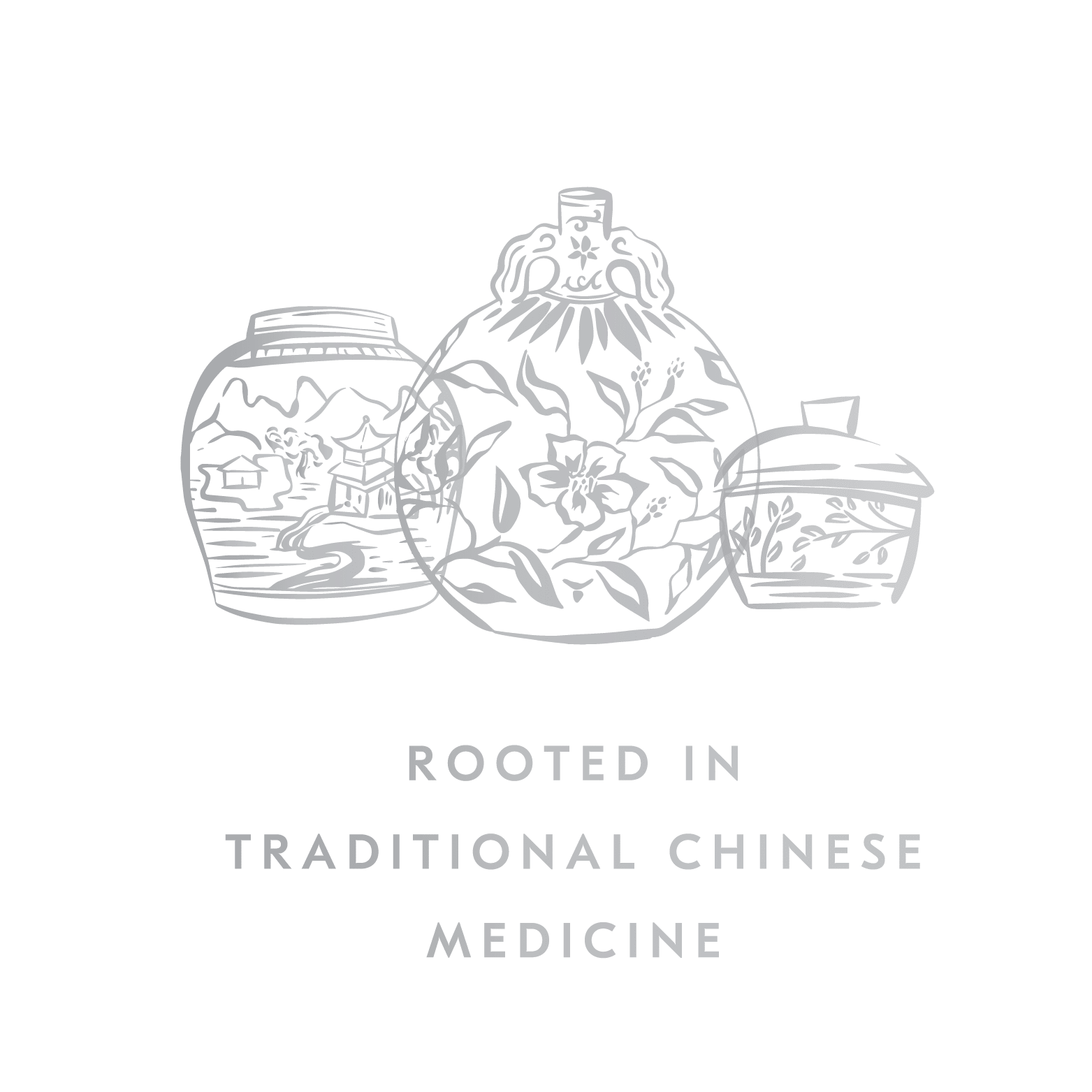
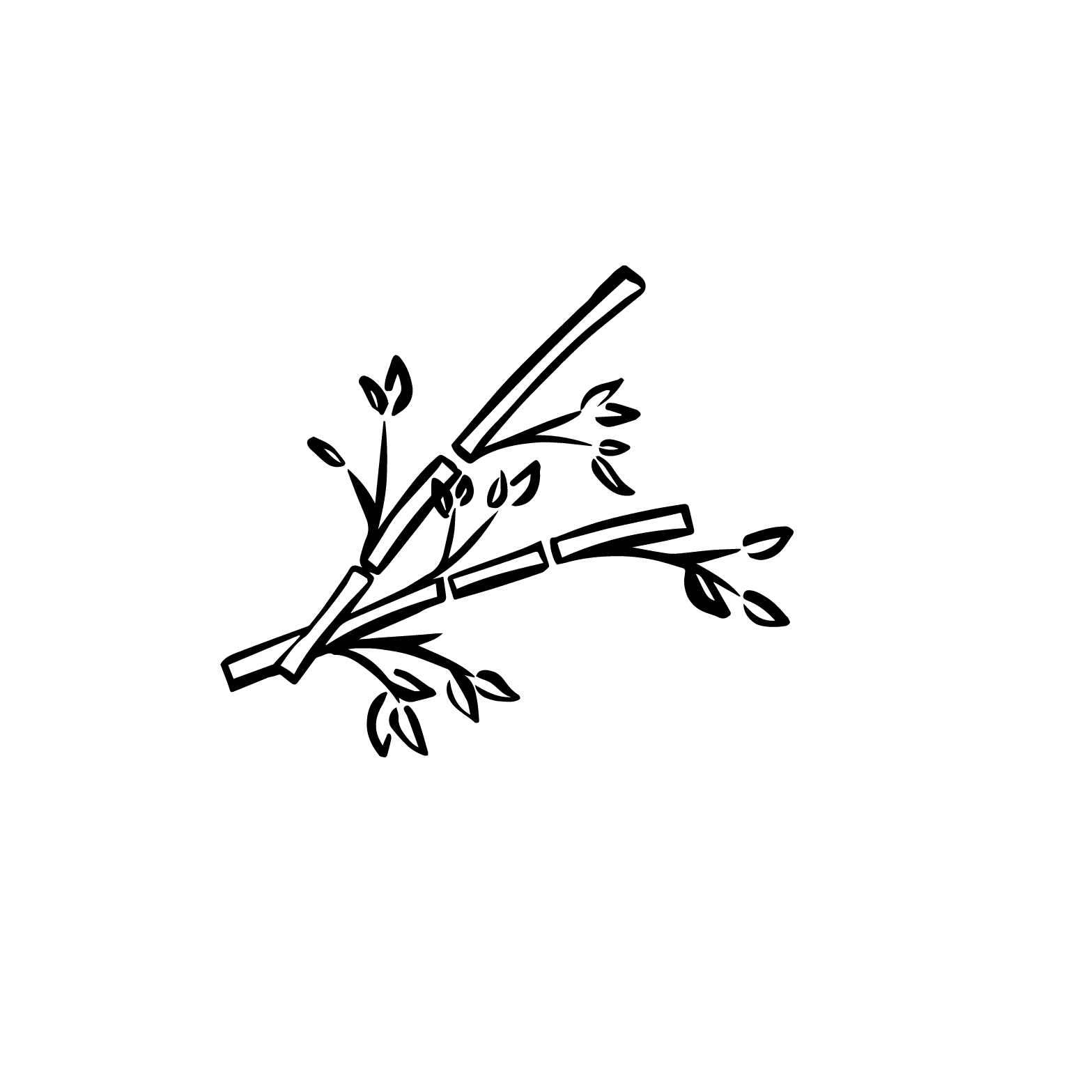
The mark is a hand drawn illustration of Mount Penglai, the inspiration for the brand’s name. Based in Chinese mythology, Mount Penglai was home to magical fruits that healed injuries, cured disease, and granted eternal youth. The illustration’s thick and thin lines are reminiscent of traditional painting styles.
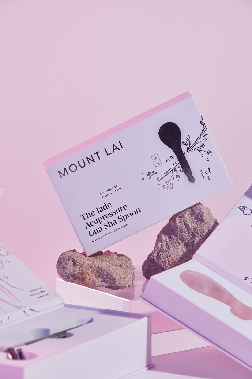
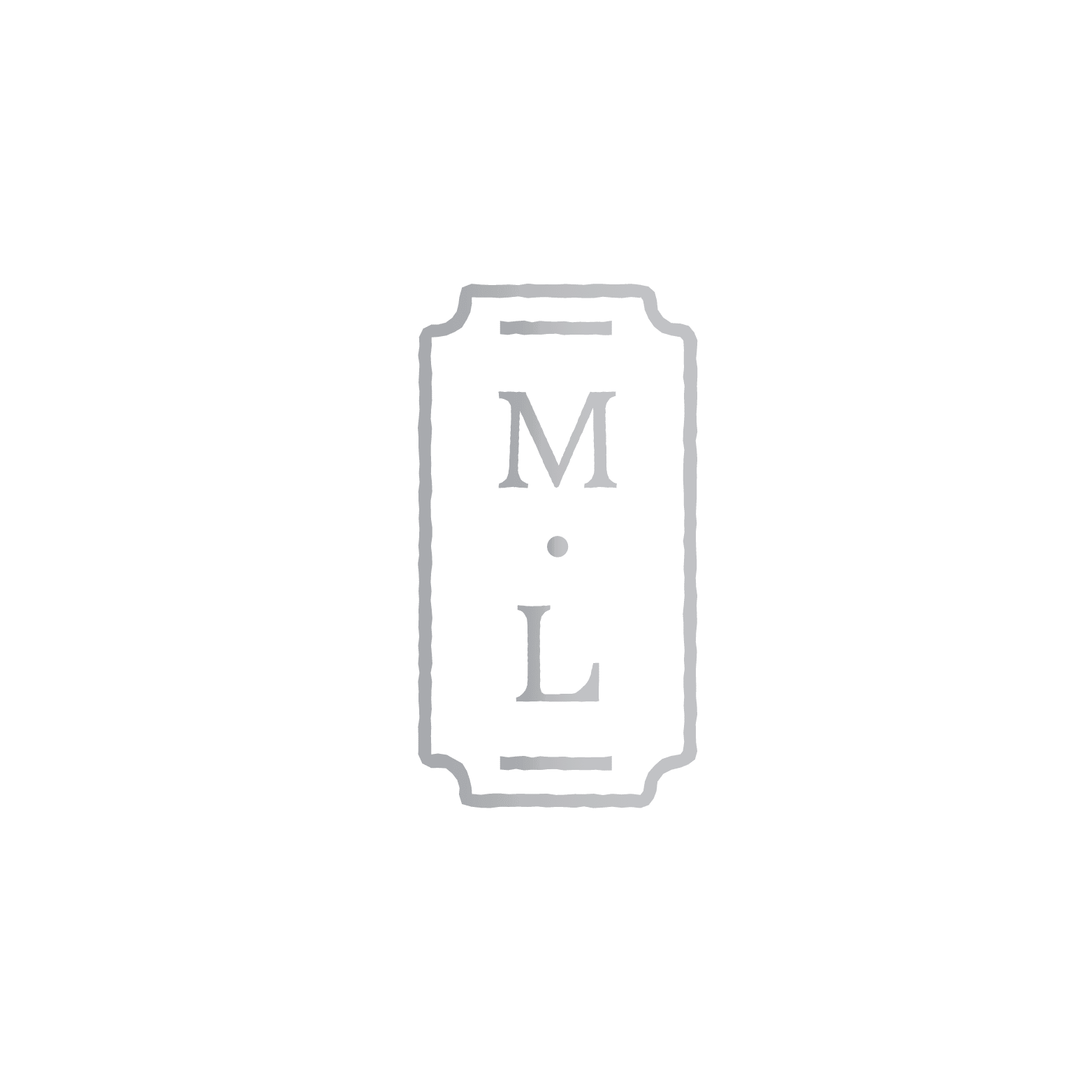
A monogram featuring the M and L are inspired by traditional Chinese stamps, stacked vertically in the tradition of Chinese writing, and create a kind of brand signature that adds a personal, authentic touch to the brand's visual language.
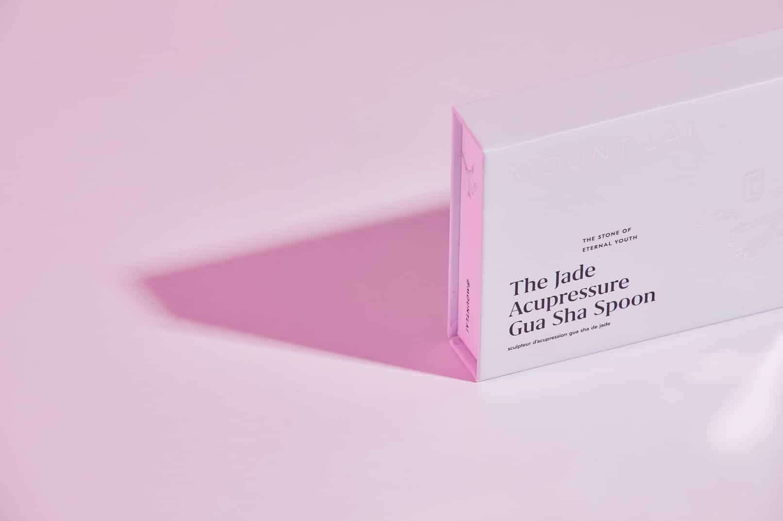
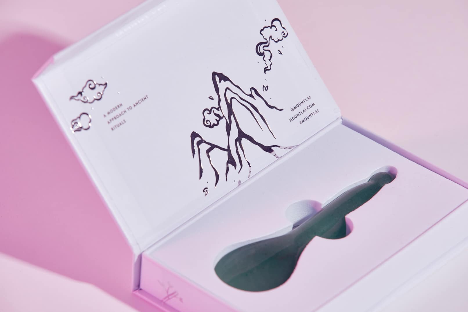
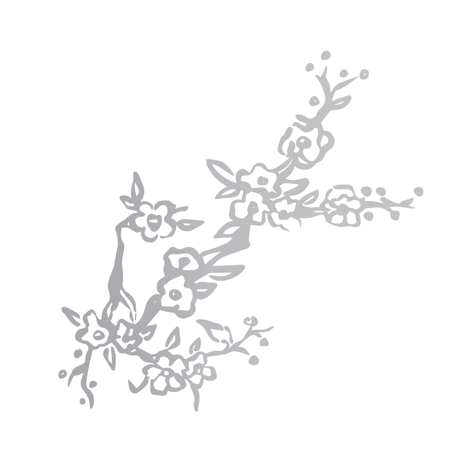
A collection of hand drawn graphic elements paired with copy expands the brand’s visual language, adds interest, and can be used across multiple applications.
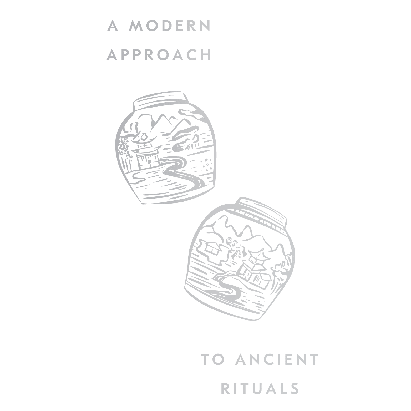
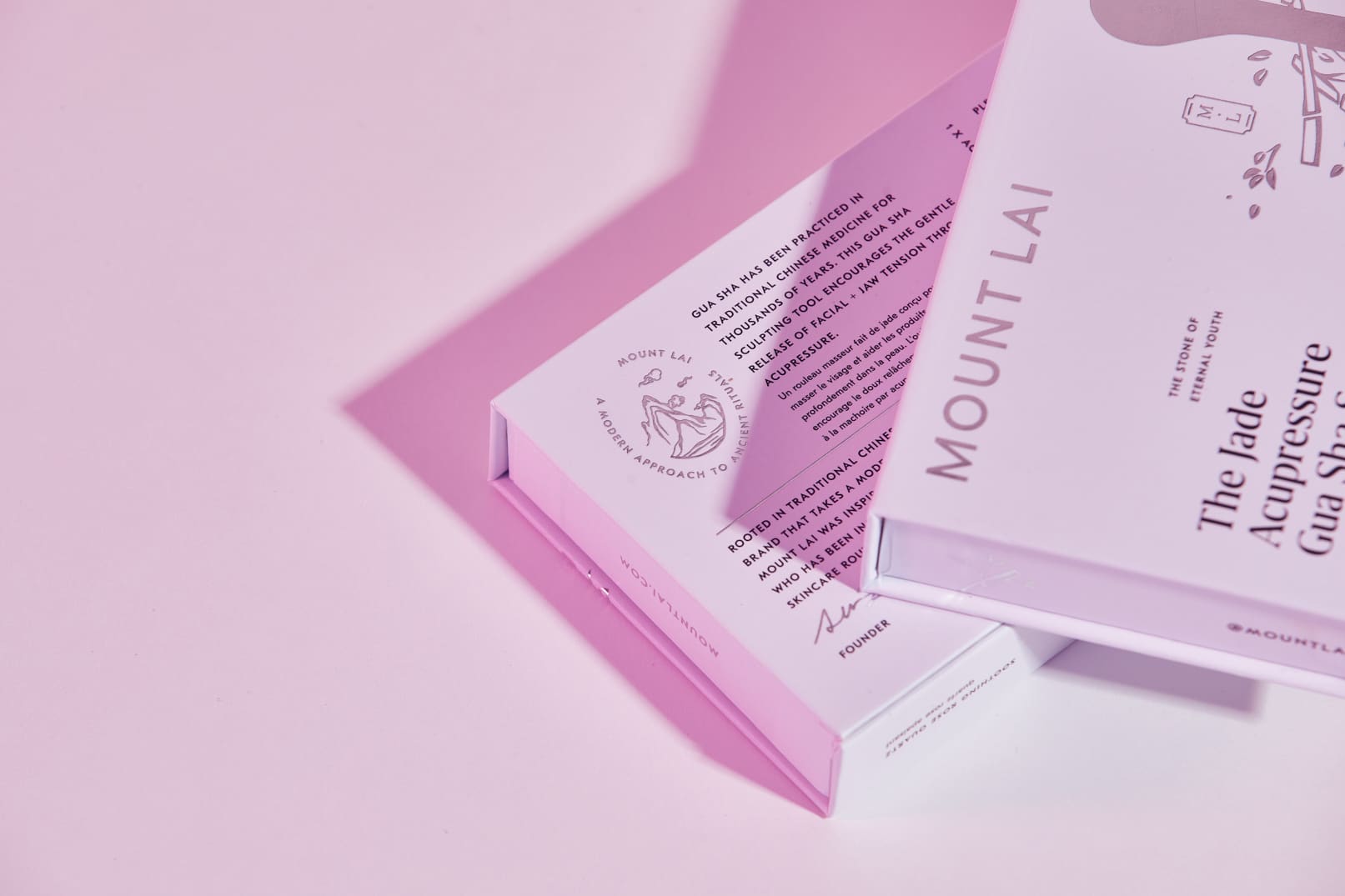
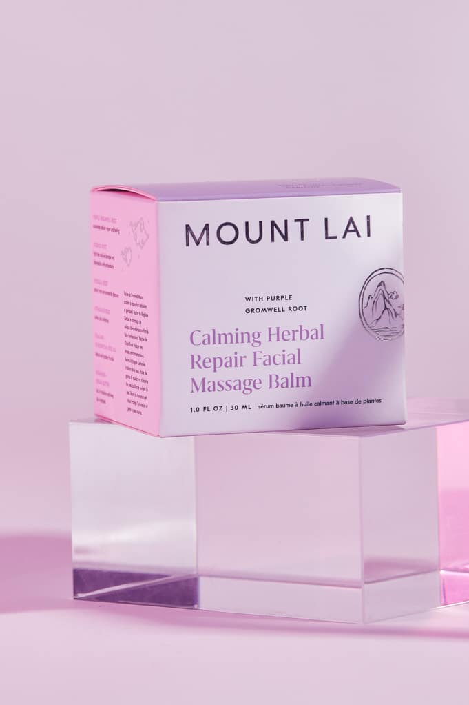
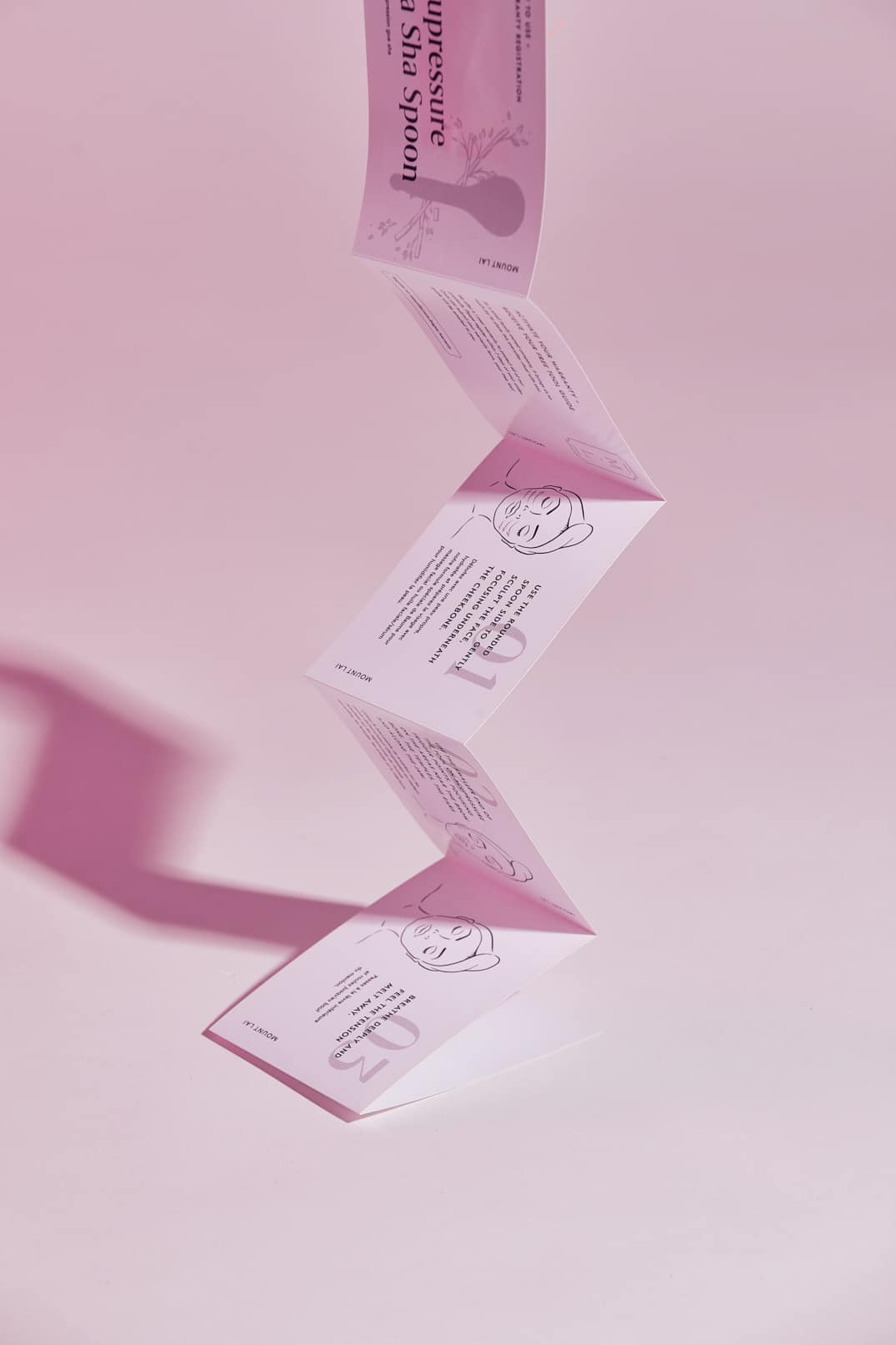
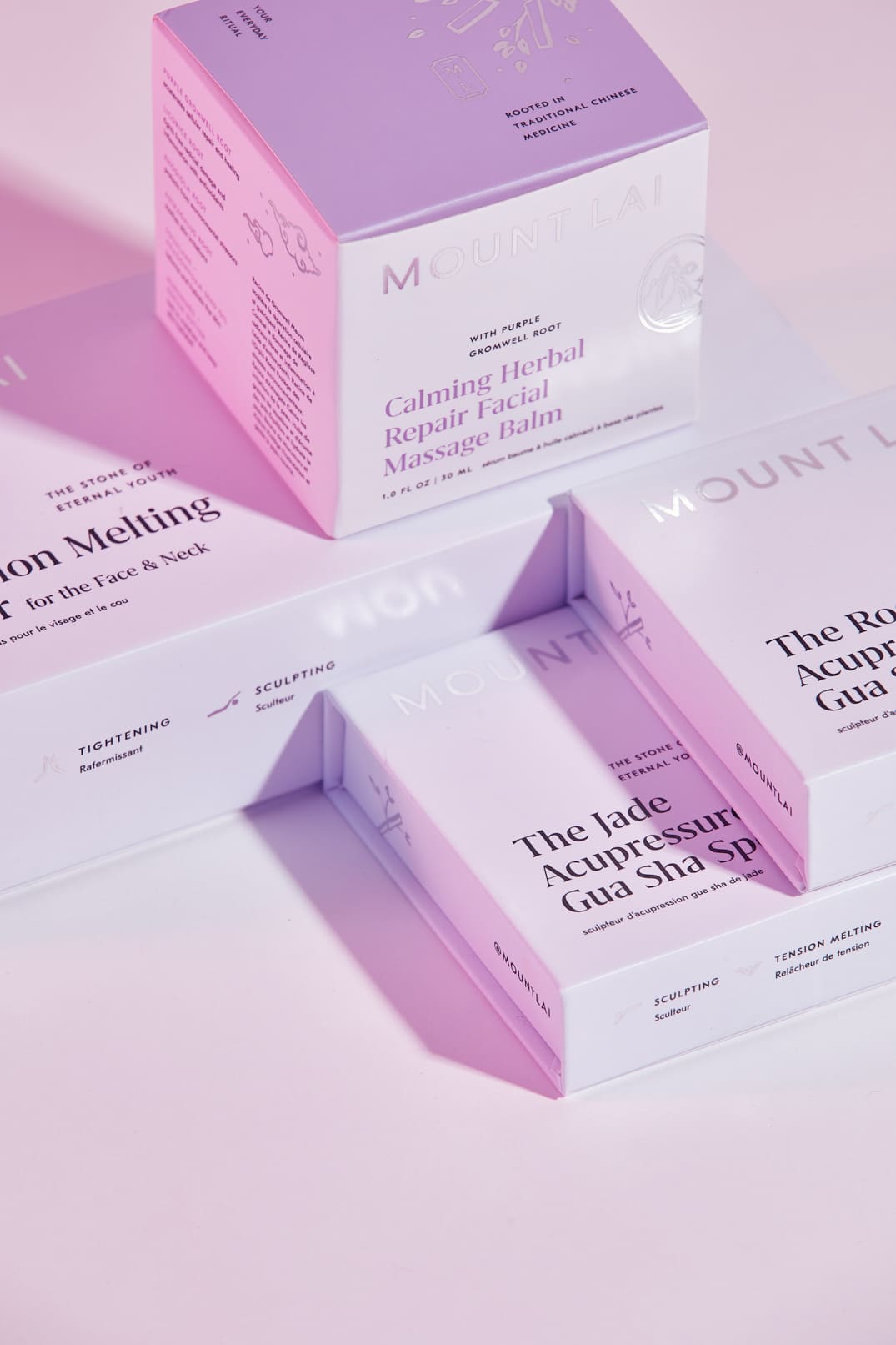
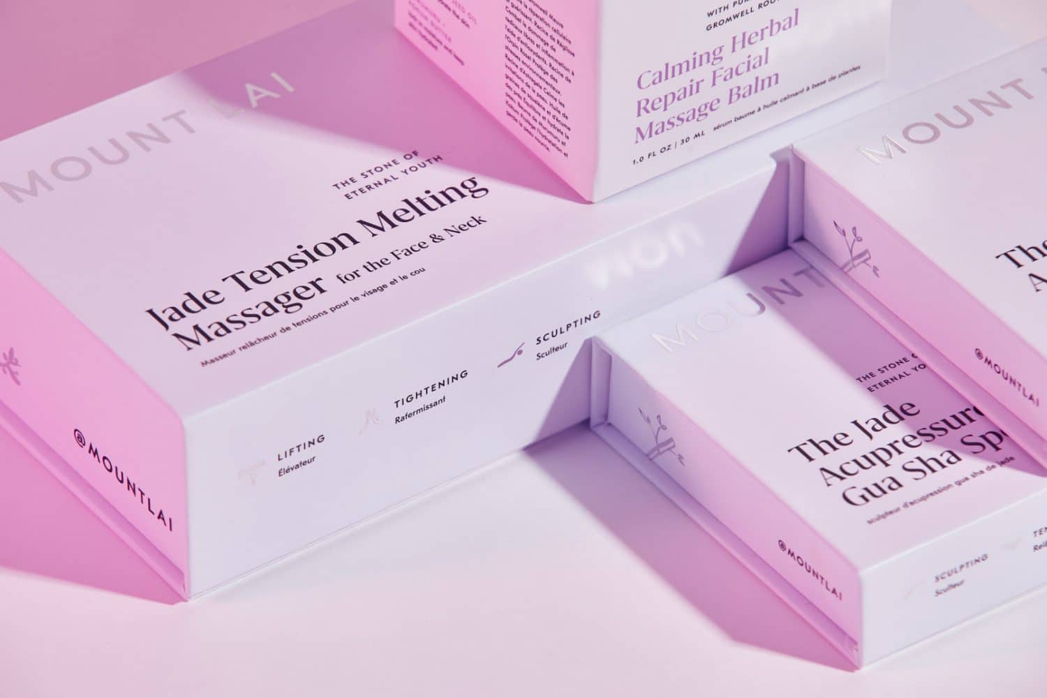
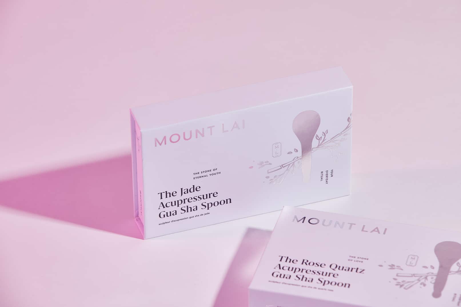
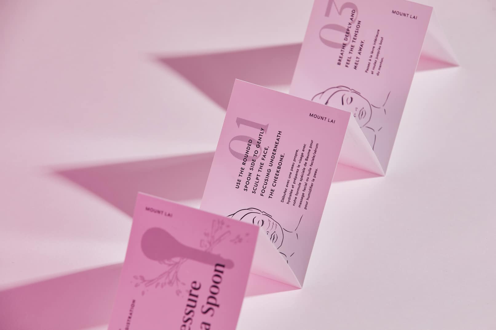
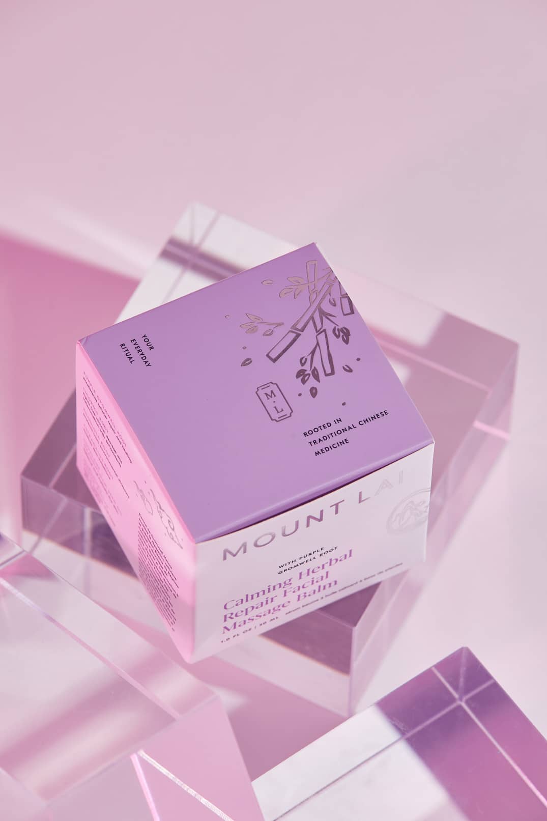
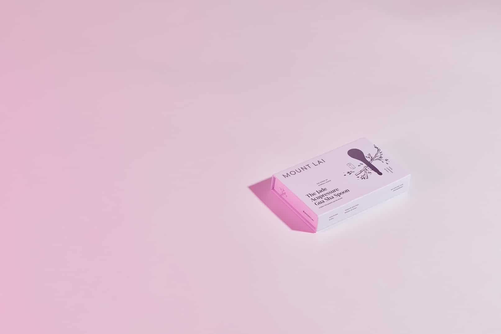
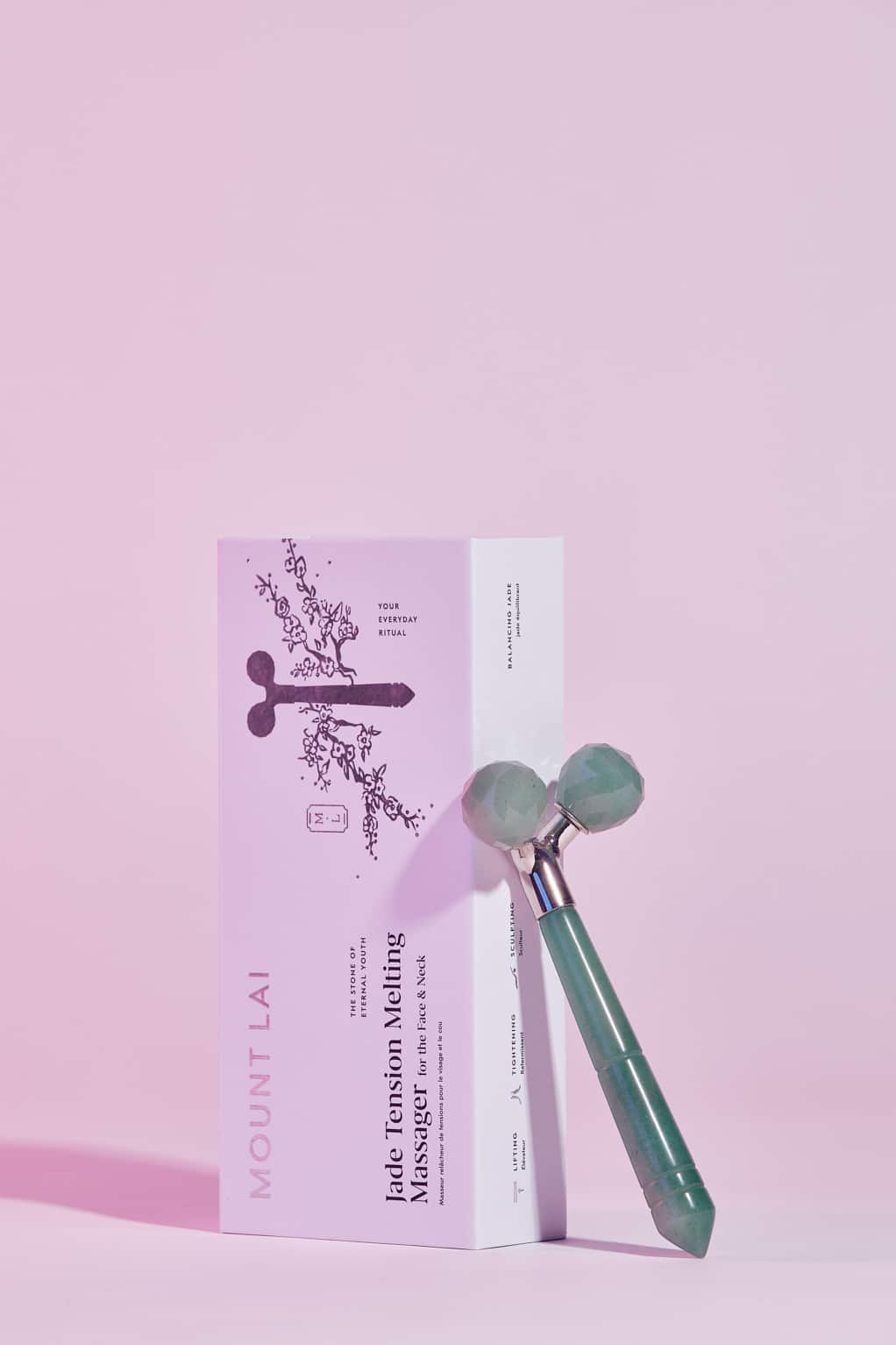
The packaging system utilizes the family of hand drawn graphic elements, typography, and colors to engage and inform customers. A mix of both utility and beauty, the system also provides instructions for product use — delivering on the brand’s mission to help clients achieve healthy, radiant skin.
A color palette of white, black, steel, and taupe reflects the brand’s elevated, timeless aesthetic.
