Capabilities
- Brand Identity
- Brand Positioning
- Copywriting
- Digital Media
- Illustration
- Packaging
- Web Design
Objective / Solution
Rosebud is redefining and pioneering quality, transparency, and authenticity in the hemp industry.
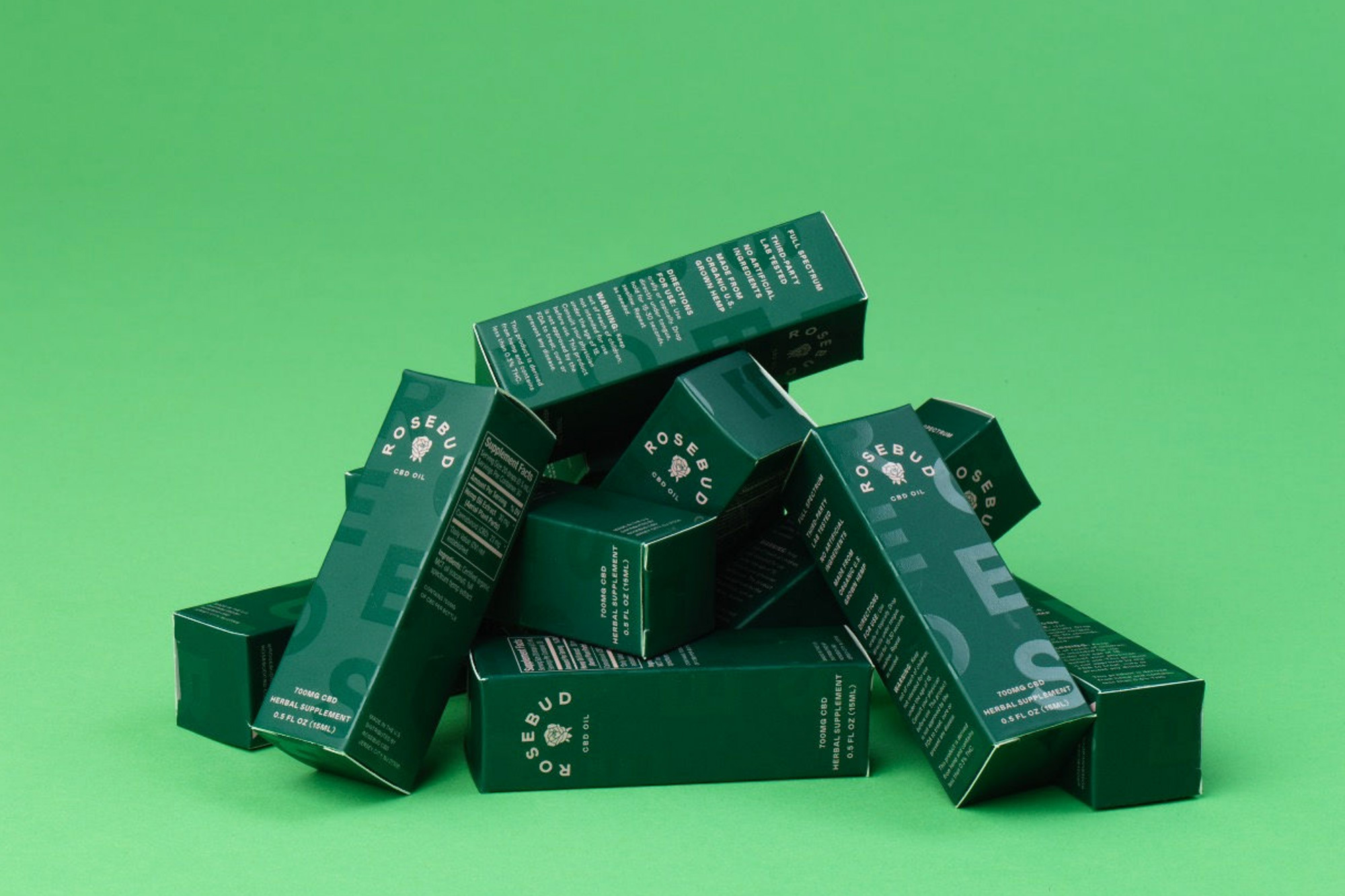

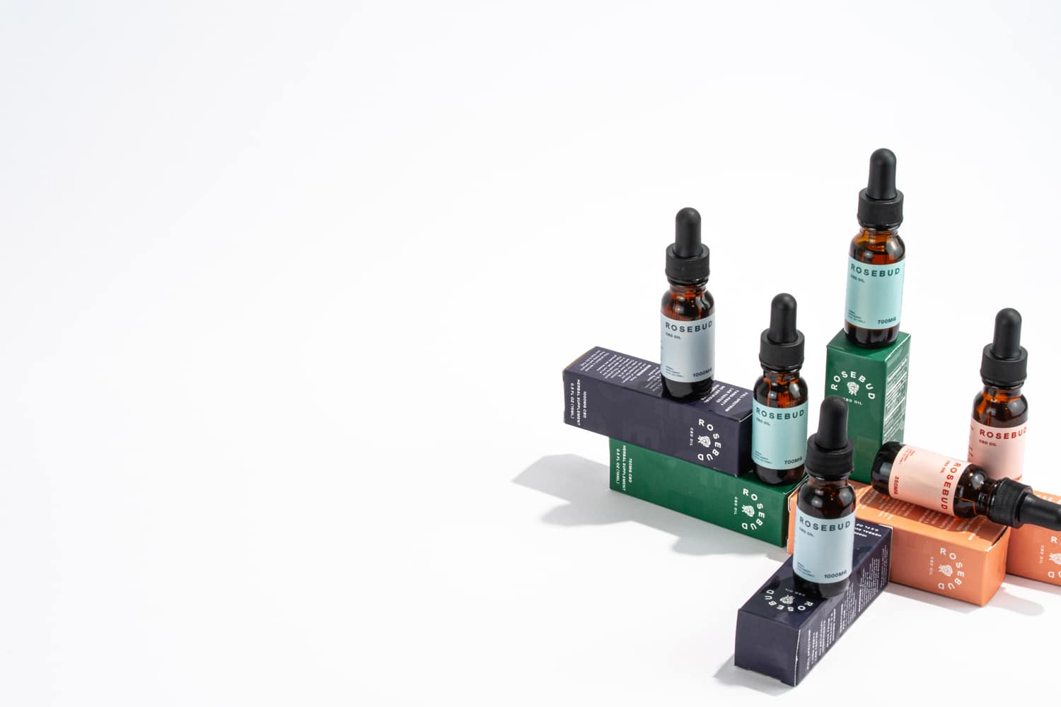
There’s no one-size-fits-all-approach to dosing. Color distinguishes the CBD levels, making it easy to find your sweet spot.
The ecommerce site utilizes bold typography, graphic product photography and relevant content to engage and educate the user.


Bold san serif typography paired with a rich color palette conveys the simplicity of the product - no fillers, additives, flavorings, preservatives or sweeteners.


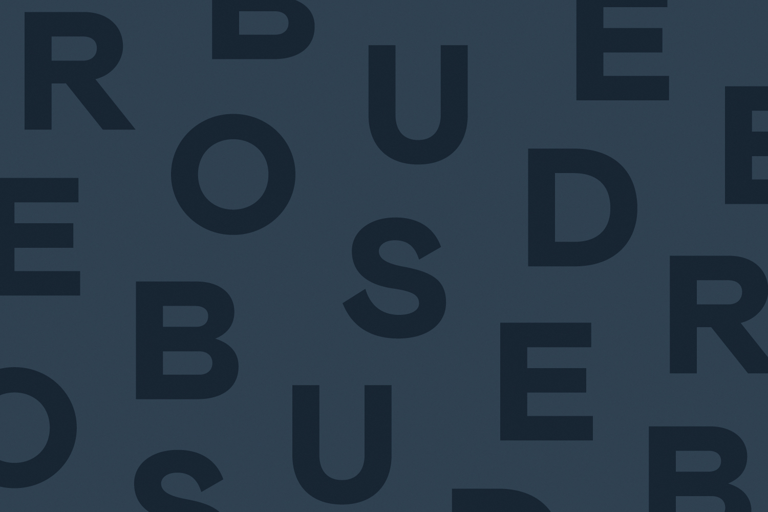

An elevated approach to the branding and packaging matches the integrity and quality of the Rosebud products.


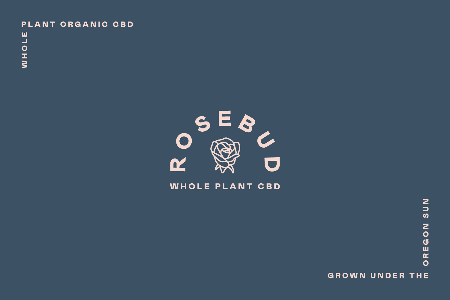

Fueled by a genuine connection, a series of illustrations of roses and hands holding roses are used throughout the brand family. Like a rose, CBD symbolizes hope, promise and new beginnings.


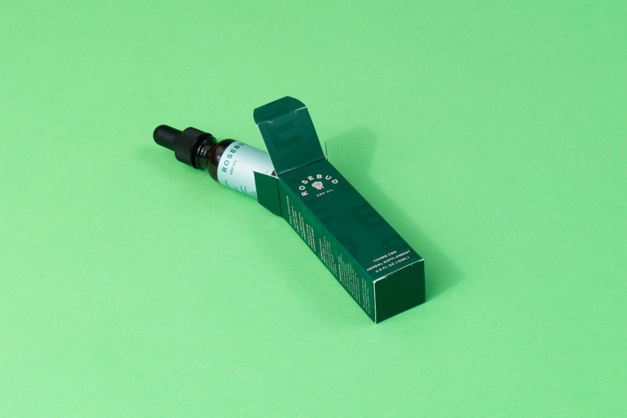


Organically grown under the Oregon sun.


